SKRN - Template Documentation
Thank you for purchasing this site template. If you have questions that are beyond the scope of this help file, visit our support forum.

SKRN uses the HTML Framework Boostrap. Bootstrap is an open source toolkit for developing with responsive HTML, CSS, and JS websites.
The full boostrap documentation and be found online here: https://getbootstrap.com/docs/4.0/getting-started/introduction/
CSS Structure
All of the CSS files are located in the head of the document. The main CSS feils are as follows:
- bootstrap.min.css - This is the default stylesheet for the HTML Framework Bootstrap. It is advised to not edit this file.
- style.css - This is the main stylesheet for your theme. This is the most likely location for your custom styles.
- //fonts.googleapis.com - The google fonts stylesheet imports custom fonts. You can find more font options here: https://fonts.google.com
- fontawesome-all.min.css - These are an icon pack called FontAwesome. You will find out more about these icons furhter in the documentation.
- Iconsmind__Ultimate Pack - These are an icon pack called IconsMind. You will find out more about these icons furhter in the documentation.
- landing-page-styles.css - The landing page stylesheet only appears on the landing.html file. This includes styles that pertain to the demo site landing page only.
Tablet/Mobile Styling
The responsive styling for the site template is located in the style.css file. You will find all of these styles under the last section of the document "24. RESPONSIVE STYLES". The mobile navigation will be covered in the "Navigation" section of the documentation further down.
Color Customizing
We have placed all the green highlight colors in one section of your style.css file. This makes it extremely easy for you to customize the main colors of the theme. You will find the main green color "#3db13d" uner the section "03. HIGHLIGHT COLORS" of your style.css file. Example:
/*
=============================================== 03. HIGHLIGHT COLORS ===============================================
*/

ul#friends-activity-profiles li.friends-activity-profiles-more a,
a.edit-profile-sidebar,
ul.dashboard-sub-menu li.current a:after,
body .asRange .asRange-pointer:before,
body .asRange .asRange-selected,
.checkbox-pro-container .checkmark-pro:after,
span.user-notification-count,
ul#registration-steps-pro li.current-menu-item .registration-step-circle-icon {
	background:#3db13d;
}
JavaScript Structure
All of the JavaScript files are loaded in the footer or your site. All JavaScript plugins have been added seperately. This allows you to easily add/remove javascript plugins in order to optimize your site speed. Here is an overview of all the javascript files:
- jquery-3.3.1.min.js - The jQuery javascript library is a javascript library required on every page. It offers the base framework for most javascript through the site.
- popper.min.js and boostrap.min.js - Both of these are required for the Bootstrap HTML Framework. These add-in default functionality for bootstrap.
- navigation.js - This file holds the javascript for the Navigation Dropdowns and Mobile Navigation
- jquery.flexslider.min-js - This javascript file adds the ability for the various sliders on the site.
- jquery-asRange.min.js - This adds a javascript library for the range slider in the advanced dashboard search section.
- circle-progress.min.js - This file adds the ability for the circle graphic for ratings
- afterglow.min.js - This file adds the video player abilities.
- script.js - This file will likely be the most customized. It contains all the javascript options for the various plugins. It also includes the show/hide javascript for the header areas.
- script-dashboard.js - This file is similar to the script.js file. Except that it adds javascript functionality that only appears on the dashboard pages. You can combine this with the script.js file if you want.
The HTML Framework Boostrap already has a grid system built-in. This allows you to easily add rows & columns. In addition you have the ability to control the columns on multiple device sizes.
You can find the full bootstrap grid documentation online here: https://getbootstrap.com/docs/4.0/layout/grid/
Bootstrap’s grid system uses a series of containers, rows, and columns to layout and align content. It’s built with flexbox and is fully responsive. Below is an example and an in-depth look at how the grid comes together.
New to or unfamiliar with flexbox? Read this CSS Tricks flexbox guide for background, terminology, guidelines, and code snippets.
Here is an example three column layout:
<div class="container">
  <div class="row">
    <div class="col-sm">
      One of three columns
    </div>
    <div class="col-sm">
      One of three columns
    </div>
    <div class="col-sm">
      One of three columns
    </div>
  </div>
</div>
The header and sidebar navigations are controlled by the same navigation plugin. They both have similar options that include the ability to have drop-down menus. The Javascript for the navigation can be found under the "js/navigation.js" file. The activation for the javascript is located in the script.js file.
The styles for the navigation menu are located in the style.css file. The landing page navigation styles are located in the "06. NAVIGATION STYLES" section. The dashboard sidebar navigation styles are located under the section "08. DASHBOARD NAVIGATION STYLES"
Here is an example of the default navigation with a drop-down menu. The important classes to keep in mind are "normal-item-pro" for any navigation items. Then the class "current-menu-item" if you want the navigation item to appear selected.
<nav id="site-navigation-pro">
	<ul class="sf-menu">
		<li class="normal-item-pro current-menu-item">
			<a href="index.html">Home</a>
		</li>
		<li class="normal-item-pro">
			<a href="dashboard-home.html">New Releases</a>
				<ul class="sub-menu">
					<li class="normal-item-pro">
						<a href="#!">Sub-menu item 1</a>
					</li>
					<li class="normal-item-pro">
						<a href="#!">Sub-menu item 2</a>
					</li>
					<li class="normal-item-pro">
						<a href="#!">Sub-menu item 3</a>
					</li>
				</ul>
		</li>
	</ul>
</nav>
Sticky Navigation
We have an option sticky navigation built-in to the site template. To turn the landing page header sticky, add hte class "sticky-header" to the Header tag like so:
<header id="masthead-pro" class="sticky-header">
If you are using a tall menu in the sidebar, you can add javascript to auto expand the sidebar so it is alawys visible. To do so add the class "sticky-sidebar-js" to your nav#sidebar section like so:
<nav id="sidebar-nav" class="sticky-sidebar-js">
Tablet/Mobile Navigation
The Tablet/Mobile Navigation will appear when the browser size is below 959px. This is controlled via css in the last section of the style.css file. The man navigation is hidden and the mobile navigation is displayed:
/* Mobile Navigation */
#site-navigation-pro, #masthead-pro .btn-header-pro {
	display:none;
}

nav#sidebar-nav, #sidebar-bg:before, #sidebar-bg:after {
	display:none;
}

#header-user-notification, #video-search-header {
	display:none;
}

#video-logo-background:after, #video-logo-background:before {
	display:none;
}

#mobile-bars-icon-pro {
	display:block;
}
Mobile Navigation HTML
The HTML for the mobile navigation is seperate from the main navigation. This is located in the "mobile-navigation-pro" nav section. This allows you to have a custom navigation on tablet/mobile.
An example of this can be found here:
<nav id="mobile-navigation-pro">
	<ul id="mobile-menu-pro">
		<li>
			<a href="index.html">Home</a>
		</li>
		<li>
			<a href="dashboard-home.html">New Releases</a>
				<ul>
					<li class="normal-item-pro">
						<a href="#!">Sub-menu item 1</a>
					</li>
					<li class="normal-item-pro">
						<a href="#!">Sub-menu item 2</a>
					</li>
					<li class="normal-item-pro">
						<a href="#!">Sub-menu item 3</a>
					</li>
				</ul>
		</li>
	</ul>
</nav>
The various hero sliders located in the site template are powered by the javascript plugin "Flexslider." You can find a list of all the options for the slider here: https://github.com/woocommerce/FlexSlider
The JavaScript for the sliders are located in two places:
script.js - This javascript effects the options for the landing page sliders (index.html).
script-dashboard.js - This javascript effects the options for all the dashboard pages.
An example from script.js file:
$('.progression-studios-slider').flexslider({
	slideshow: true,  		/* Autoplay True/False */
	slideshowSpeed: 8000,	/* Autoplay Speed */
	animation: "fade",		/* Slideshow Transition Animation */
	animationSpeed: 800, 	/* Slide Transition Speed */
	directionNav: true,		/* Left/Right Navigation True/False */
	controlNav: true,		/* Bullet Navigaion True/False */
	prevText: "",
	nextText: "",
});
Slider Styles
The styling for the sliders can be found in the style.css file. The landing page (index.html) styles are located in the section "19. HOMEPAGE STYLES". The dashboard slider styles are located in the section "11. DASHBOARD SLIDER STYLES".
The default FlexSlider styles are located in the section "20. FLEXSLIDER DEFAULT STYLES". This seciton controls things like the left/right navigation styles and bullets.
Slider Height
The slider height is controlled in a number of ways. Here is an example from the site template that is 85% of your browser height (vh). You can adjust this to any other vh OR to a pixel number like 700px.
.flexslider.progression-studios-dashboard-slider {
	background:#fafafa;
	height:85vh;
}

.progression-studios-slider-dashboard-image-background {
	height:85vh;
	background-repeat: no-repeat;
	background-position:center center;
	background-size: cover;
}
Mobile Slider Height: The sliders do have a minimum height also set on mobile. This min-height is 640px and located at the end of the style.css file (line 4549):
.progression-studios-full-height-slider .progression-studios-slider-dashboard-image-background,
.flexslider.progression-studios-dashboard-slider.progression-studios-full-height-slider {
	min-height:640px;
}

.flexslider.progression-studios-dashboard-slider,
.progression-studios-slider-dashboard-image-background {
	min-height:640px;
}

.flexslider.progression-studios-dashboard-slider,
.progression-studios-slider-dashboard-image-background {
	min-height:640px;
}
Slider Responsive Styles
We have adjustsments for font sizes and spacing on tablet and mobile. These are located in the style.css file in the section "24. RESPONSIVE STYLES"
Overlay on Mobile
On a some of the sliders we have an overlay color added on mobile. This is so the text is more readable on mobile as the background image is limited. This is added via the class "progression-studios-slider-mobile-background-cover". You can search for the class in the style.css file to see how the color is added.
This site template uses two font icon packs. This allows you to place icons on your site along with the ability to adjust the size and color.
FontAwesome
The social media icons and various bullets/arrows are added via the free FontAwesome font pack. You can find a list of icons on this page: https://fontawesome.com/icons. You can use any "free" icon throughout your site. Here is an example of how easy it is to display an icon:
<i class="fab fa-facebook">
Iconsmind Ultimate Pack
The SKRN site template also includes the premium Iconsmind font pack: https://iconsmind.com/.
You can find a list of all the icons in your site template files under /icons/Iconsmind__Ultimate_Pack/Link Icons/demo.html. Also, you can find them listed online here:
Adding the icon to a page is easy as adding this HTML:

<span class="icon-User"></span>
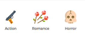
Genre Icons (Image)
The gengre icons used in the theme are a custom image icon, not a font. You can find the original photoshop version of these icons if you want to edit them via photopshop. They are located in /Additional Files/Original Design/genres-icons.psd in your download.
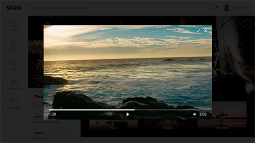
Skrn has video support built-in to the theme. You can see examples of this on the dashboard-home.html and dashboard-movie-profile.html pages. The video player we are using is an open source video player: http://afterglowplayer.com
This player supports locally hosted videos, Youtube, & Vimeo. Full documentation for this video player can be found online: http://docs.afterglowplayer.com
You can open the video player in a lightbox by using the class "afterglow" on a link. Then link to the video player with the matching id. Example:
<a class="progression-studios-slider-play-btn afterglow" href="#VideoLightbox-1"><i class="fas fa-play"></i></a>

<video id="VideoLightbox-1" poster="https://cdn.plyr.io/static/demo/View_From_A_Blue_Moon_Trailer-HD.jpg?v1" width="960" height="540">
	<source src="https://cdn.plyr.io/static/demo/View_From_A_Blue_Moon_Trailer-HD.mp4" type="video/mp4">
	<source src="https://cdn.plyr.io/static/demo/View_From_A_Blue_Moon_Trailer-HD.webm" type="video/webm">
</video>
If you would like to place a video on a page without a lightbox, you can use the class "afterglow" on the video element like so:
<video class="afterglow" poster="https://cdn.plyr.io/static/demo/View_From_A_Blue_Moon_Trailer-HD.jpg?v1" width="960" height="540">
	<source src="https://cdn.plyr.io/static/demo/View_From_A_Blue_Moon_Trailer-HD.mp4" type="video/mp4">
	<source src="https://cdn.plyr.io/static/demo/View_From_A_Blue_Moon_Trailer-HD.webm" type="video/webm">
</video>
Landing Page: The landing.html pages do not have required javascript in the footer. If you want to add a video to those pages, you will need to include the video javascript in the footer:
<script src="js/afterglow.min.js" defer></script><!-- Video Player JS Plugin -->