Solus - Single Property Theme
By Progression Studios
Thank you for purchasing this theme. If you have any questions that are beyond the scope of this help file, visit our support forum.
Theme & Plugin Installation
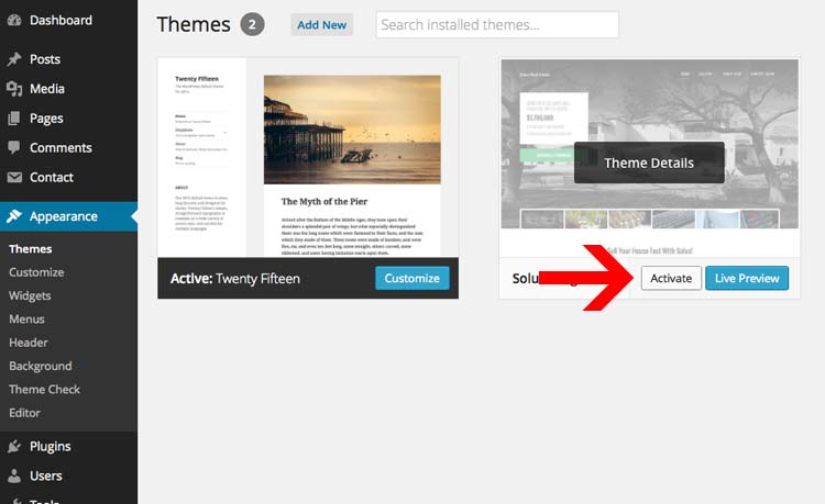
To install your theme in WordPress you must navigate to the menu "Appearance" on the left and then the submenu "Themes". From that page you should see your current list of themes like "Twenty Fourteen". Now click the "Add New" button at the top. Then click on the text button at the top "Upload". You then should click Choose File and find your theme files on your computer and upload them. Note: You are only uploading the folder "Solus-Theme.zip" Your final step is to "Activate" your theme.
If you have any issues installing your theme. Visit this faq: Solving Broken Theme/Stylesheet Missing WordPress Theme Issues
Plugin Installation/Activation
After installing your theme, you will be prompted to install a set if additional plugins. Click on the "Begin Installing Plugins" text link to install the plugins. We strongly recommend installing theses upon the initial installation. You can also deactivate and remove them later on.
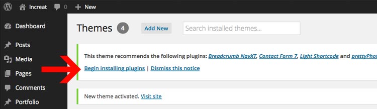
You will then view hte "Install Required Plugins" page. You can also reach this page under Appearance > Install Plugins. You can select all the items and Bulk Install the plugins or install the plugins one at a time.
Note: Make sure to "Activate" the themes after you install theme.

Getting your URLs to display page names instead of numbers
By default the pagenames will be website.com/p15 instead of website.com/about. To fix this go to "Settings" > "Permalinks" and my recommendation is to change the Common Settings to "Day and name". After choosing "Day and Name", Click "Save Changes" and your done. Your urls will now display a proper Permalink structure.

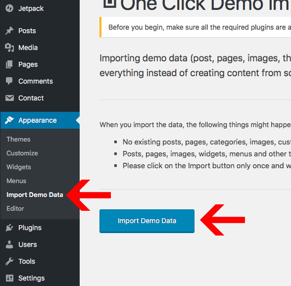
Importing Demo Content
You can import the demo content under Appearance > Import Demo Data. Just click "Import Demo Data" and wait until the importer notifies you the import is completed. Please click import only once and wait, it can take a couple of minutes. If you click import mulitple times it will duplicate the menu items under Appearance > Menus. However the pages themselves will not be duplicated.
Theme Options & Colors
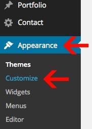
You can easily adjust the theme options by going under Appearance > Customize like so:
Uploading a logo
From there you can click on headings like "Theme Settings" & "Home Settings" to adjust the theme. The logo for example is edited under "Theme Settings". You can click on the logo and Upload a new image.
After you add your new image, you will need to adjust the logo width.
Note: You can easily adjust the navigation height by adjusting the settings "Navigation Padding Top" and "Navigation Padding Bottom". Just adjust those numbers as needed if you want your logo height to match your navigation height.

Adjust Post Per Page, Column Count, Pagination, etc.
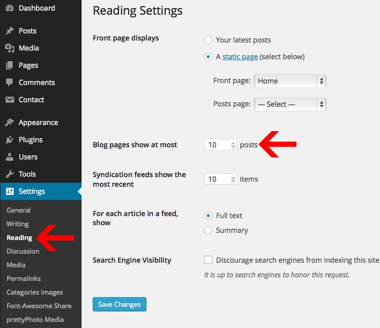
Post Per Page: You can adjust the posts per page under Settings > Reading > Blog pages show at most X posts.
Color Scheme Modifications
You can easily adjust the color scheme of the theme within the theme customizer. We have two sections for these: "Background Colors" and "Font Colors".

You can easily adjust the color and click "Save" at the top. If you don't like the change, just click on "default" to reset the color to it's original color.
Need to adjust more colors?
If the font or background color you want to change isn't listed in the Theme Customizer, check the style.css file. We have a table of contents at the top that points out all of the sections within theme. You can also look-up styles using FireBug for FireFox or Safari/Chrome Inspector. This will allow you to edit additional places within the theme.
How to use Firebug for Firefox to look-up styles in the style.css file: https://www.youtube.com/watch?v=6eTW8-C6_gk
How to use Inspector for Safari & Chrome to look-up styles in the style.css file: https://www.youtube.com/watch?v=nOEw9iiopwI
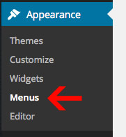
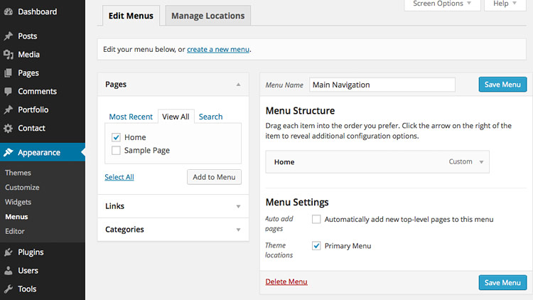
Navigation Menus
The navigation is easy to customize. You can add pages, categories, or even custom links. Both of the Navigation Menu's are edited in the "Appearance" section under "Menus".
Step 1) Create a Menu
To start, create a new menu. You can click on text link "create a new menu". Then, just entered in a menu name and click "Create Menu".
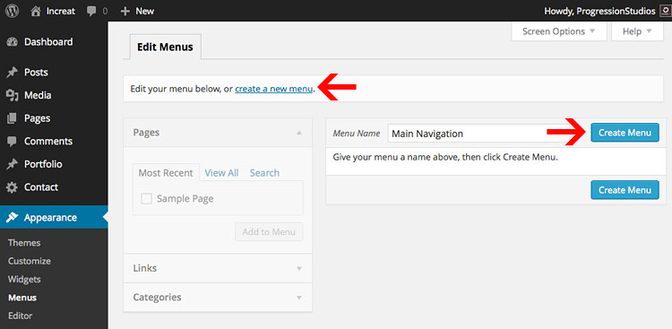
For this example, we created a Menu Navigation with the name "Main Navigation".
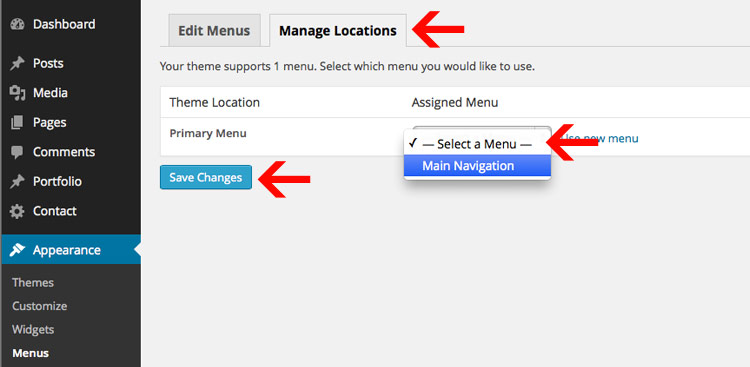
Step 2) Select a Menu under Theme Locations
After you have created your menu, you need select the Theme Location. You can do this by going under the "Manage Locations" tab at the top. Then select a menu under "Primary Menu" and click "Save Changes". Now you have a navigation menu set to your theme.
Step 3) Add pages to your Menu
The final step is adding pages and links to your newly created Menu. You can just select a page via the check-box and click "Add to Menu".
Then the page will be added in the Menu list on the right. You can drag menu items around to order them. Or customize/delete the menu items by clicking on the down arrow on the right. Once you are done customizing your menu, click "Save Menu".
Step 5) Making Sub-Menu's
You can make multiple level's of sub-menus. All you need to do is drag the menu item that you want inside the sub-menu under-neath the parent menu item. There will be an option to indent the item, so that the sub-menu item looks like it is pushed inside of the parent menu item. See example, "Sample Page" is in a sub-menu of the parent page Home:
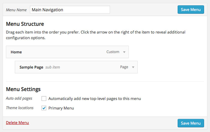
Image Gallery & Video
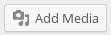
To add a gallery, simply click on the "Add Media" button.
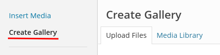
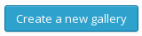
Then click on the "Create Gallery" text in the top left.
To add images from your hard drive, drag and drop your files into the box that appears, or click Select Files to choose a picture from your computer to upload. Then click Create a new gallery at the bottom right.
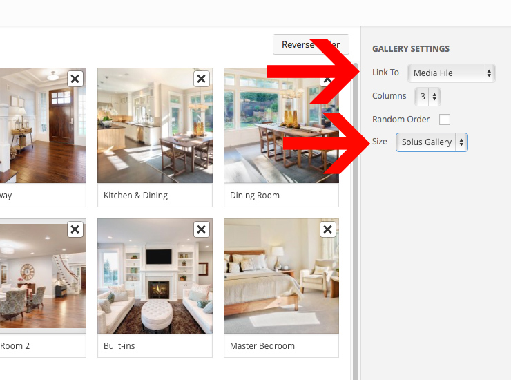
On the following screen, click on each image to edit its title, caption, alternate text, and description. (Only the caption will be displayed for the slideshow gallery type.) You can also click and drag photos to re-order them as you like, or choose the Reverse Order or Random Order options:
Note: Under Gallery settings, make sure to select the size "Solus Gallery" for the image size. And Link to: Media File in order to open the image up in a larger version.
Make Galleries open in a lightbox
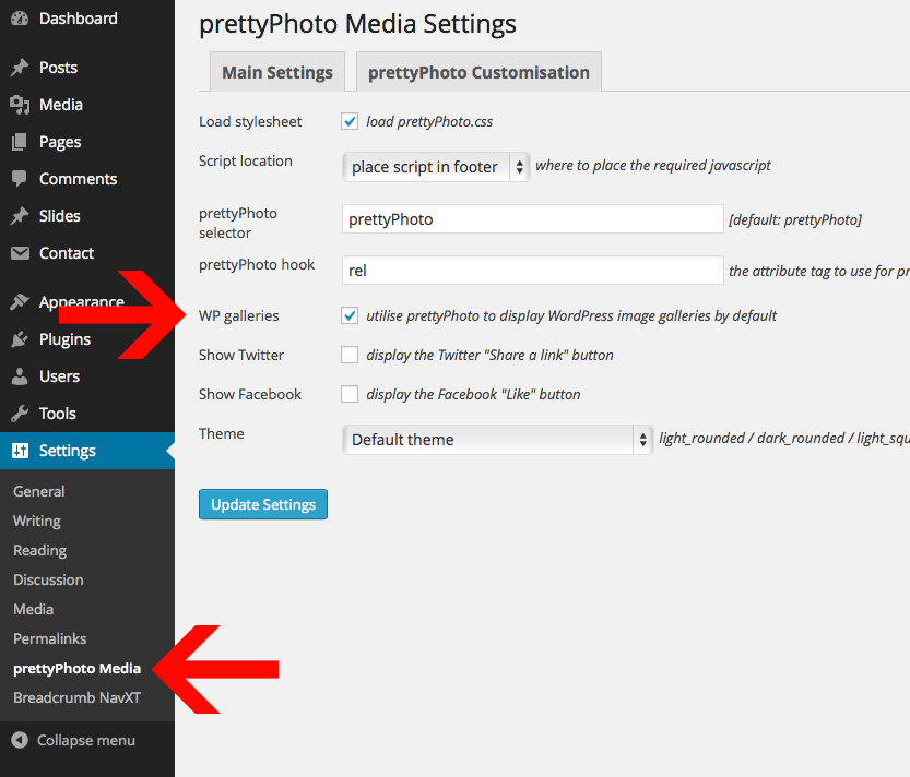
You can turn the lightbox pop-up for galleries on under Settings > prettyPhoto Media. Just check the first box "WP galleries" so they open automatically in the lightbox.
Video Embed
You can easily embed videos in WordPress. Most of the time this is as easy as copy/pasting the URL onto the page. Documetnation on embedding videos can be found here: http://en.support.wordpress.com/videos/
Creating the Homepage
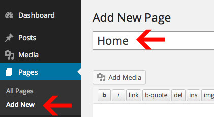
Step 1) Add New Page
By Default the home-page will display the latest blog posts. In order to setup your theme like the Theme Demo, you will need to create a new page. We called our page "Home".
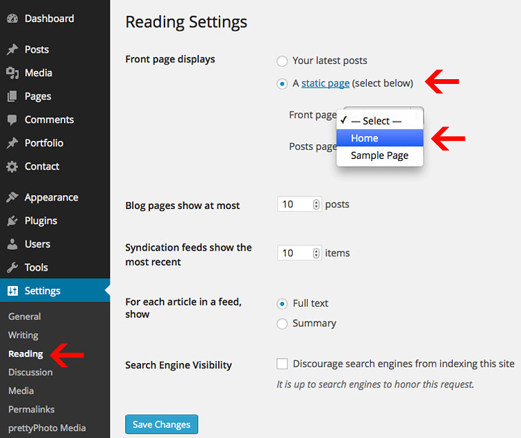
Step 2) Set your page as the homepage
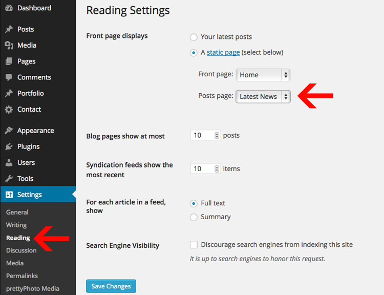
Next, you will go to "Settings" > "Reading" in the WordPress Dashboard.
From there you will change your "Front page displays" from Your latest posts to "A static page". You will want to choose the page you created from the drop-down for 'Front Page'.
Once you've chosen your new Front Page, you can click "Save Changes" and you will now have a custom home-page.
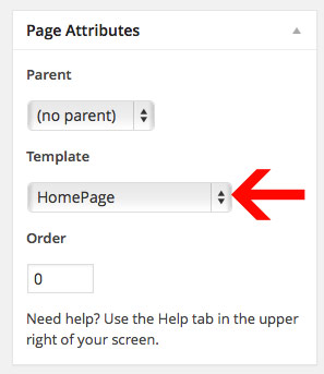
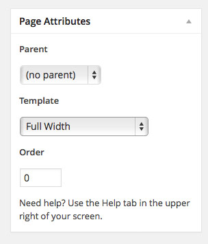
Step 3) Set your page template
The home-page from the Live Preview uses a custom page template named "Homepage". You can select this under "Page Attributes" > "Template". This can be done in the right sidebar when editing any page.
Note: You will select this option while editing the actual page.
Adding Simple Text & Shortcodes
You can add text to your homepage by just typing text in on your homepage. Also, there is an optional Homepage Sidebar if you want to display basic content + a sidebar.
Homepage Widgets
The Live Preview is built using widgets. Your homepage widget areas are "Home: Widgets" and "Home: Widgets on all Pages". The only difference between the two is that Home: Widget on all Pages will display the widget on all pages at the bottom.
Note: You can only use "Home:" widgets in the homepage widget areas. Here is a list of available widgets for the homepage.
- Home: Highlight Widget
- Home: Map Widget
- Home: Page Content Insert

Here is a screen-shot of the live preview showing the widgets used:


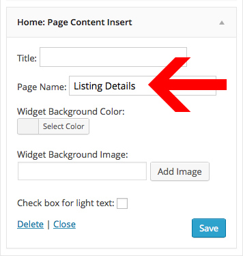
Home: Page Content Insert (Property Details & Property Gallery)
The Home: Page Content Insert widget pulls in content from any page. You just add the widget to your homepage widget area and then choose which page to use. For example, in the live preview we pull in various details in three columns. This is just a normal page that we created using shortcodes. We then pulled the page in using the Home: page Content Insert Widget.
Homepage Slider
The featured slider is automatically created when you select the Homepage template. You can control the slider options under Theme Customizer > Slider Settings .
Start by creating a Slides Post
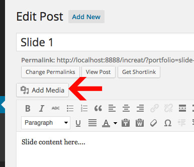
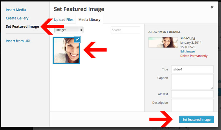
Each slide is a slides post. You select an image by setting it as a featured image.

Setting an Image for each Slide (Featured Image)
In order to add an image to the slides, you must set the image as a featured image. All of the resizing will be handled automatically. Just click "Add Media" and upload the image. Then click "Set Featured Image" and select your image. The last step is to click "Use as featured image". See the example below.
Slider Autoplay, Timer, and Transition Adjusting:
You can control the slider options under the Theme Customizer > Slider Settings .
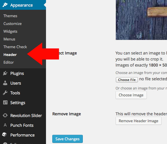
Header Background
You can adjust the header backgrounds under Apperance > Header
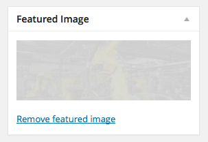
Per Page Header Background
You can customize the header image on pages by setting a featured image for a page.
News/Blog Section
Creating the blog page is simple. You will need to create a page that you would like to be your Blog (We created a page called "Latest News"). Then you need to need to go to "Settings" > "Reading" in the left sidebar. Under Front Page displays you will want to select "A static page". Then for "Posts page" you will select whatever page you want to be your Blog to be and click "Save Changes".
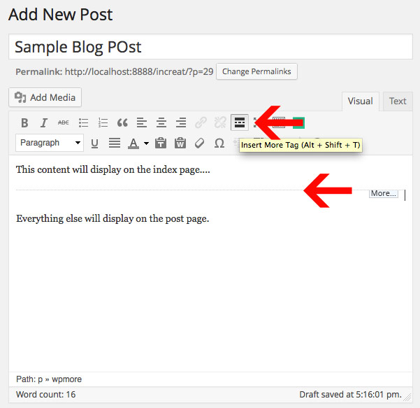
Adding the 'Continue Reading' Button (Cut-off content on index)
By default the blog-posts on the blog index will display all content. If you want to cut-off the blog-post on the index earlier, you will use the "Insert More" tag. The information above the break will be displayed on the Blog Index and all other information will be displayed on the post page. You can find the button for in default text editor as shown in the example.
Note: The "Insert More" tag will also display the 'Continue Reading' text.
Inserting an Image to your Post (Featured image)
Just click "Add Media" and upload the image. Then click "Set Featured Image" and select your image. The last step is to click "Use as featured image". See the example below.
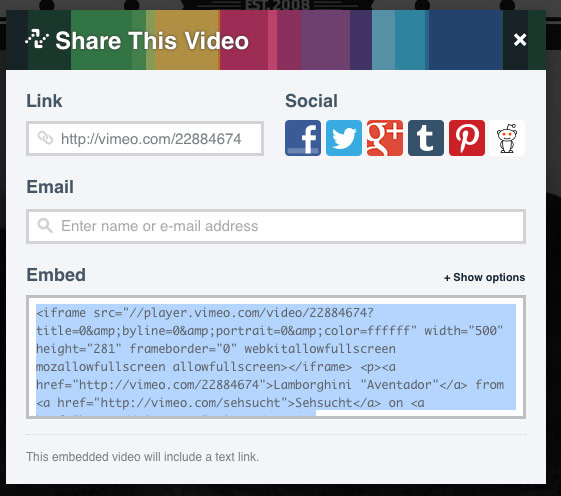
Adding audio/video to your Post
You just need to find the embed code to your video and paste that into the Audio/Video Embed box. Example:
Note: The video will automatically be resized for you.
<iframe src="http://player.vimeo.com/video/22884674?title=0&byline=0&portrait=0&color=ffffff"
	width="400" height="225" frameborder="0"></iframe>
Getting the embed code
You can get the video embed code from vimeo, youtube, and etc. easily by clicking on the "Embed" link on their website as shown below in the image:
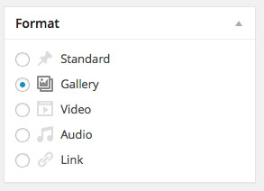
Gallery Post
Posting a gallery is simple. First you will select the "Gallery" post format.
When using the media uploader, you can select the drop-down to see only items "Uploaded to this post". This will show you what items are in your actual gallery. You can then adjust the image order using drag/drop and remove any images if necessary.
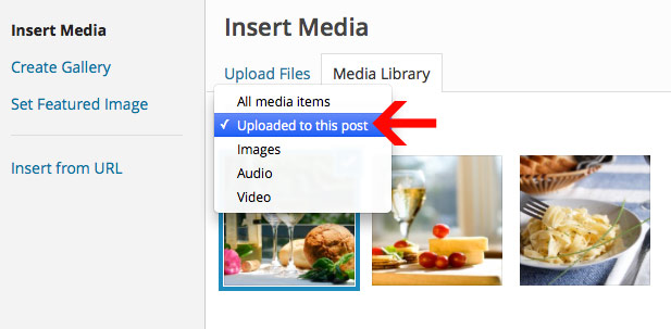
Note: Do not click "Inser Gallery" or "Insert into Post". The gallery is automaticaly created when using the Gallery Post Format.
Change the number of Blog posts per page
Changing the number of blog posts that display on the index is just a matter of going to Settings > Reading.
Contact & Full Width Pages
The Contact & Full Width Pages are controlled via Page Templates. You can select this while editing pages in the sidebar on the right under the heading "Page Attributes".
Contact Page
The Contact Page can be created by using the default page OR full width page templates. There is no custom contact form page template. You will create this page with the Map shortcode AND Contact form Shortcode.
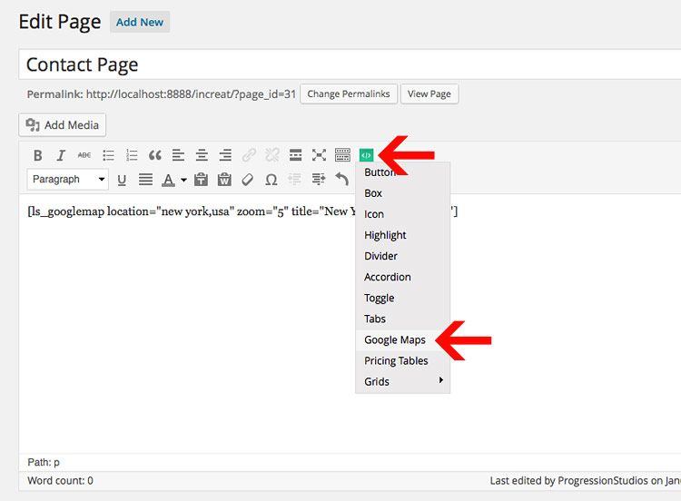
Inserting the Map into the Contact page
You can easily insert the map into the Contact Page via the short-codes. Just click on the Shortcodes button in the editor an add "Google Maps". You can then adjust the zoom level, location, and height of the map (The map will automatically be 100% width):
Note: You will add-in the map shortcode under the page settings "Contact Page Map Short Code".
[ls_googlemap location="new york,usa" zoom="5" title="New York" height="500"]

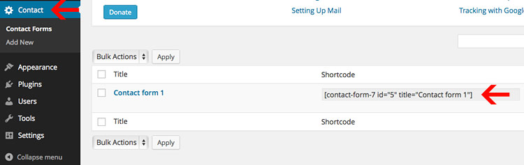
Inserting the Contact Form onto the page
Youo can easily add-in a contact form by clicking on the "Contact" post type. Then copy the shortcode like so and paste it into your Contact Page:
[contact-form-7 id="5" title="Contact form 1"]
Learn more about how to use & customize the Contact Form here: http://contactform7.com/docs/
Here is the code used in the form code used in the live preview:
	<p>[text* your-name placeholder "YOUR NAME"] </p>

	<p>[email* your-email placeholder "EMAIL ADDRESS"] </p>

	<p>[text* your-phone placeholder "PHONE NUMBER"] </p>

	<p>[textarea your-message placeholder "SPECIAL INSTRUCTIONS/COMMENTS"] </p>

	<p>[submit "Request a showing"]</p>
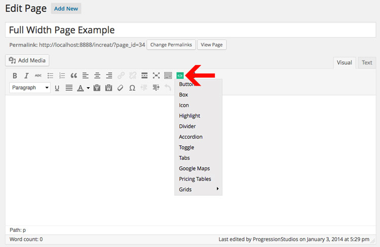
Full Width
The Full Width Page can be created by selecting a custom Page Template "Full Width" under Page Attributes.
Theme Shortcodes
This theme has some built in short codes to help you build your theme. You can find the short codes demoed in the Live Preview Short Codes page.
Built into the Post Editor
The Short codes are build-in to the post editor so you never have to memorize or look-up a short code again!
Icons
You can easily add-in icons into buttonslike so:
[ls_button icon_right="fa-home" color="default" url="http://progressionstudios.com"]Default Button[/ls_button]
You can see a full list of icons here: http://fontawesome.io/icons/. Just find the icon you want to use, and place in the text.
Note: You can easily remove the icon from a butotn by removing that option icon_right="fa-home" like so:
[ls_button color="default" url="http://progressionstudios.com"]Default Button[/ls_button]
Translating
You can easily translate this theme via:
http://wordpress.org/plugins/codestyling-localization/Install and activate the plugin and go to Tools > Localization (shown in your language), then follow the instructions on how to translate the theme.
Customizations
We do not offer support for customizations or extending our framework. This section is just additional information for developers and buyers that want to extend our framework and are comfortable making adjustments to theme files.
Note: We are available for hire via our website if you need help with customizations. Just fill out our contact form with your project details.
Child Theme
We always recommend using a child theme if you are extending a theme. Here is a great plugin to quickly build a child theme:
One Click Child Theme
WordPress Child Theme Documentation
Responsive layout
This site is beautiful at any size, be it a 17" laptop screen or an iPhone. All of the styles for the responsive layout are located here: /css/responsive.css
The responsive grid is controlled via "Media Queries". Magnolia uses media queries to serve the scalable grid, but also for the convenience of styling your site on different size screens. Magnolia's media queries are almost exclusively targeted at max and min widths rather than device sizes or orientations. The advantage of this is browsers and future mobile devices that don't map to exact set dimensions will still benefit from the styles. That being said, all of the queries were written to be optimal on Apple iOS devices. The built in media queries include:
- Smaller than 960: Smaller than the standard base grid
- Tablet Portrait: Between 768px and 959px
- All Mobile Sizes: Less than 767px
- Just Mobile Landscape: Between 480px and 767px
- Just Mobile Portrait: Less than 479px
Example:
/* #Media Queries
================================================== */

  /* Smaller than standard 960 (devices and browsers) */
  @media only screen and (max-width: 959px) {}

  /* Tablet Portrait size to standard 960 (devices and browsers) */
  @media only screen and (min-width: 768px) and (max-width: 959px) {}

  /* All Mobile Sizes (devices and browser) */
  @media only screen and (max-width: 767px) {}

  /* Mobile Landscape Size to Tablet Portrait (devices and browsers) */
  @media only screen and (min-width: 480px) and (max-width: 767px) {}

  /* Mobile Portrait Size to Mobile Landscape Size (devices and browsers) */
  @media only screen and (max-width: 479px) {}
How to disable the Responsive Ability
You can easily remove the responsive styling by removing the /css/responsive.css file. If you do this, then add a body min-width otherwise tablets will have trouble rendering the background images properly:
body {min-width:1200px;}
Adjusting Image Sizes
All of the image sizes can be found in the functions.php file at the top.
Note: You must re-upload images if you adjust the sizes.
Example Blog (1140 pixels wide by 435 pixels tall). True means it is being cropped:
add_image_size('progression-blog', 1140, 435, true);
WordPress documentation on adding image sizes for your reference
CSS Styling
We have one main CSS stylesheet and it is located in the main theme folder under style.css file. The responsive styles are listed above.
Adding more Post/Page Meta-boxOptions
Just like the theme options above we are using an open-source custom meta boxes framework. You can learn more on gitbhub here (We placed our metabox options in /inc/dev7_meta_box_framework.php): Dev7studios Meta Box Framework
Photoshop Files
I've included all of my photoshop designs within the files:
- The original layered PSD Files (/Additional Files/Photoshop Files)
- Templates for site (/Additional Files/Templates)
Google Maps API Key
As of June 22, 2016 Google has started to require an API key to use Google Maps on your site. Don't worry as this is still free. You just need to register with Google and get a free API key. Then paste the key into our theme.
Step 1) Register and get an API Key here: https://developers.google.com/maps/documentation/javascript/get-api-key

Step 2) Login to your WordPress site and add your API key into your theme customizer. (Appearance > Customize > Google Maps)

Sources and Credits
I've used the following images, icons or other files as listed.
- Underscores WordPress Theme Framework
- Dev7studios Meta Box Framework
- Font Awesome Icons
- Flex slider
- Mobile Menu jQuery plugin
- Google Fonts
- Drop-Down Script
- HTML5 Boilerplate
- Skeleton Responsive Framework
- WooCommerce eCommerce Plugin
- Light Shortcode Plugin
- Contacat Form 7 Plugin
- Breadcrumb NavXT Plugin
- Flickr jQuery Feed
- Responsive Embedded Videos JavaScript
Once again, thank you so much for purchasing this theme. As I said at the beginning, I'd be glad to help you if you have any questions relating to this theme. No guarantees, but I'll do my best to assist. Feel free to rate my theme as 5 out of 5 stars. If it's not a 5 of out 5, e-mail me and let me know what I can do to improve your experience.
Michael Garcia, mike@progressionstudios.com